Visual Identity
To establish the brand identity of the University, it is important to understand what goes into creating a successful visual identity which translates to designing the most appropriate illustrations and graphics. The CLSU’s visual identity, elements, colors, and typefaces are fundamental to every design and its intentional use will align all communications in a recognizable and visually consistent way.

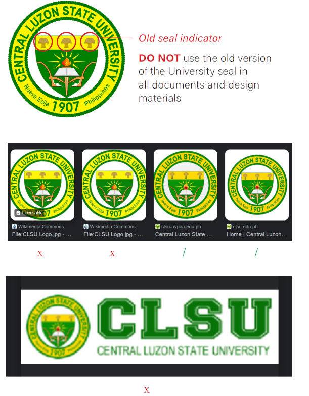
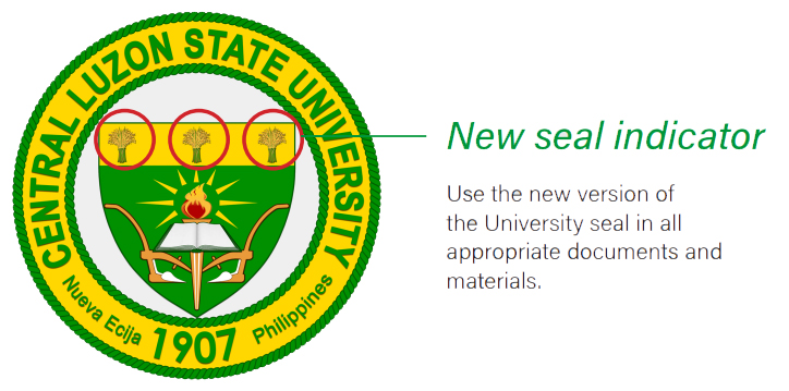
The Evolution of CLSU Seal
The seal indicates the University’s founding values, authenticity, and officialness as a state university.
The CLSU seal has undergone various transformations, yet most of its original parts have been retained. The CLAS and CLAC seals have evolved into the present signature emblem which features 7 material identities: the roped ribbons, the characters, the torch with flame and rays, the book, the bundles of palay, the shield and the plows. It has two distinct hues, the grass green and the golden yellow. As the well accepted school colors, they are now aptly described as the CLSU green and the CLSU yellow.
The contemporary signature identity was trademarked on April 2, 2016. It serves as a collective mark for various purposes, yet more particularly, for educational, scientific, and social research, technological, extension and training services, including business and promotions and publications purposes.
The Seal is dominantly gold and green, representing light and life. These colors symbolize its pioneering leadership in agriculture education and technology in the country since its establishment in 1907. The different elements of the Seal generally represent its mandated functions, the provision for quality and accessible education anchored on sound theories and practices, and its thrust on people empowerment for sustainable and inclusive development. It shall adopt the most recently registered version with the Intellectual Property Office (IPO).
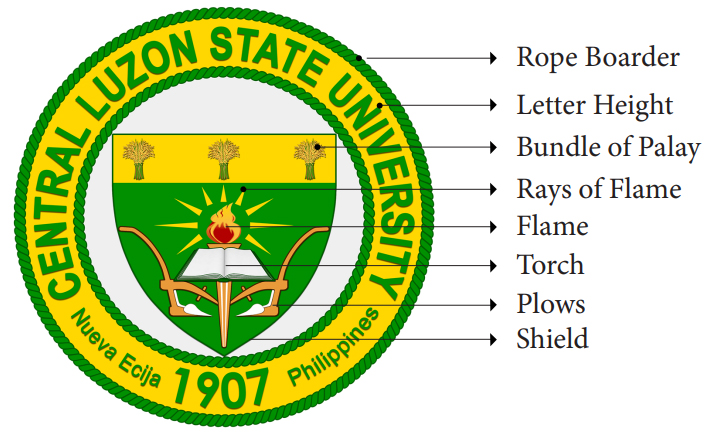
The Seal Elements
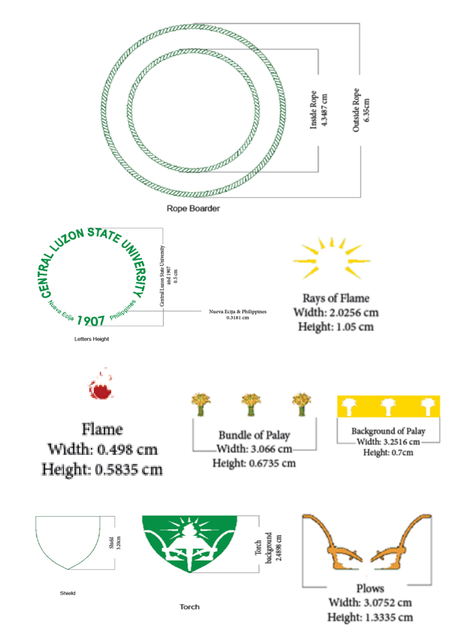
The rope-edged ribbons are designed to enclose a circular field bearing the other figures in the seal. It symbolizes the embrace of the institution to the domains of agricultural science, being a pioneer in agricultural education, and research and extension.
The characters of the university name, "Central Luzon State University", its address, "Nueva Ecija Philippines, and founding year "1907" are impressed along the continuous roped-edged ribbon.
The torch with flame and rays signifies the spirited mandate of the university to enlighten the way to learning and discovery of new knowledge. Its red flame shows the desire of the institution to serve its constituents endlessly guided by wisdom and values of good deeds.
The book was included to manifest the very purpose of the institution, that is, to serve the educational sector by abiding to the values and ethics of the academic community.
The bundles of palay indicates the end path of its origin, that is, the "harvests" from its continuous nurturing of students, academicians and scientists who will become leaders and innovators of their times. The 3 bundles represent the 3 mandated programs of its administration: Academic Affairs, Research, Extension and Training Affairs, and Business Affairs.
The shield embraces and encloses the other symbolic figures that stand for the university. It figuratively safeguards the ideals of the university to be passed on to future generations.
The plows were incorporated to remind that the institutionalization of the university started off with the traditions in Philippine agriculture and for which, its preservations are essential to make balance with the changes in technology and to harmonize it with the conservation of the natural environment.
The CLSU Seal
University Code
Article 4. University Seal and Colors
Section 1. The Seal of the Central Luzon State University is dominantly gold and green, representing light and life. These colors symbolize its pioneering leadership in agriculture education and technology in the country since its establishment in 1907.
Seal and Logotype
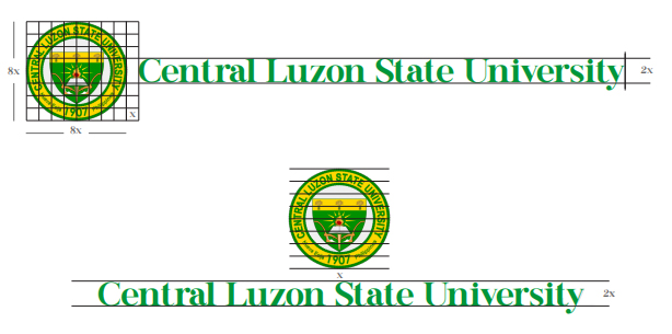
The combination of the full colored CLSU seal and logotype shall visually represent the overall university brand with the two options.
HORIZONTAL
Seal shall be on the leftmost of the logotype
with proper amount of spacing and weight
in between elements.
VERTICAL
Seal shall be on the top of the logotype with
proper amount of spacing and weight in
between elements
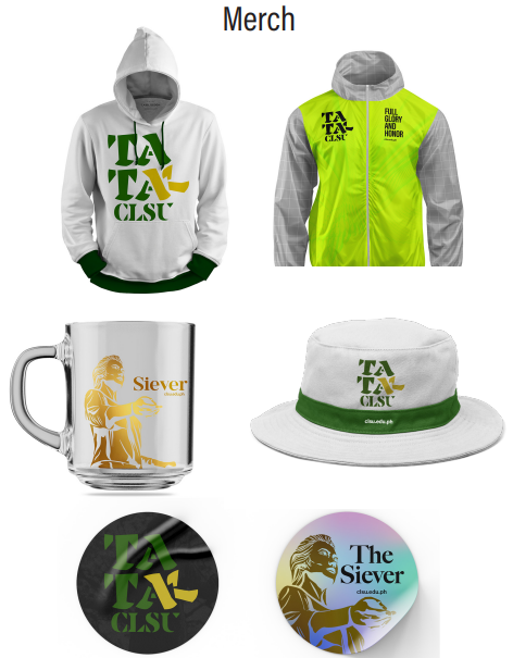
Monochrome Logo Variations

These combination of monochrome variants (black, white, green) and university monogram are reserved for CLSU official social media accounts, merch, green cobras, event banners, video extros etc.
These variants shall not be used in all official print documents.
Seal and Logotype Usage


Letterhead


The CLSU seal and logotype with business address, contact details, and ISO certification shall serve as the official letterhead of the university.
Wordmark will carry the CLSU green and typeface. A line below is included to put a breaker in between contents.
This letterhead shall be used for internal and external communication letters, certificates, legal instruments, memorandums, and designations.
Do not attempt to recreate the combination of seal and logotype.
Certificates


The certificate header adopts the CLSU seal and logotype from the letterhead. It should include the Republic of the Philippines address.
The Strategic Communication Office shall provide certificate templates and update when necessary.
Colors
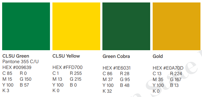
The CLSU Green and Yellow shall be the primary colors of the University.
CLSU Green is used for the official logotype and can be used as main color theme for design materials.
CLSU Yellow shall be used interchangeably with the CLSU Green as main color theme for design materials.
Green Cobra and Gold shall be used for the athletic publication materials, and merchs.
Highlight Colors
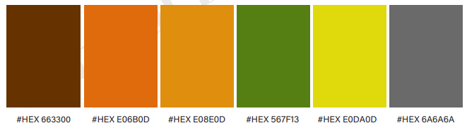
These highlight colors may be used to support the primary and secondary colors.
These are inspired by the University campus hues manifested from our diverse and historic trees, buildings, and environs.
College Colors
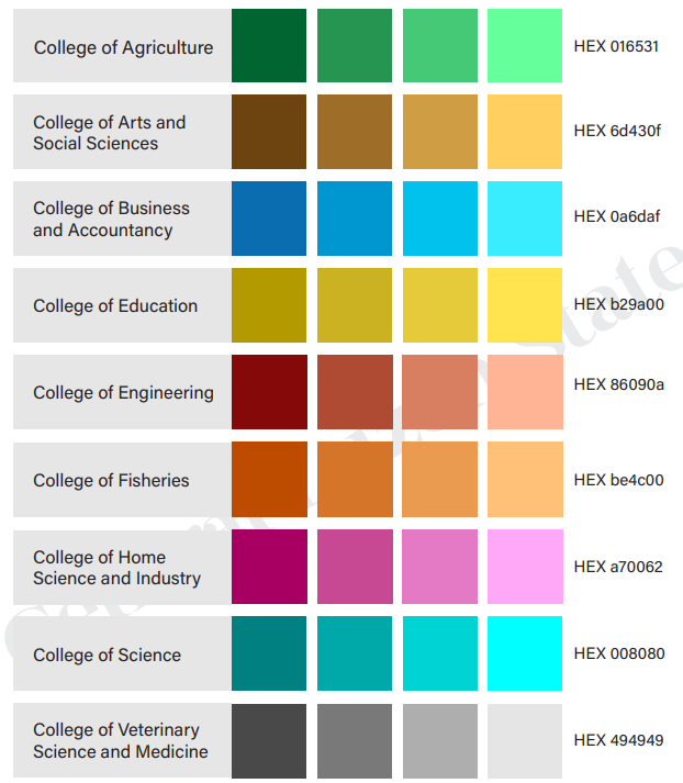
All College logos and colors shall be used for internal purposes only. Colors can be combined with its shades, monochromatic, and complementary palettes.
College colors shall not be combined with more than 2 color categories.
The Board of Regents authorizes the University President to approve the use of college logos and colors.
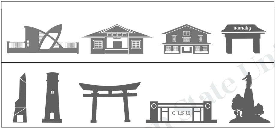
CLSU Landmarks


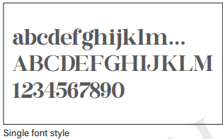
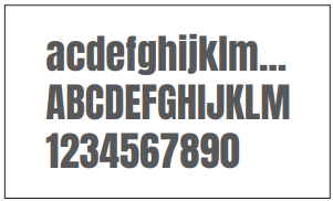
Typography Typefaces
Buttershine Serif
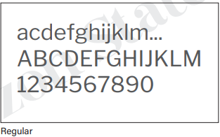
Libre Franklin
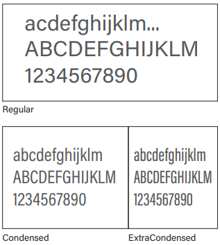
Acumin Pro
The Central Luzon State University logotype was designed using the Buttershine Serif with a proper spacing.
Buttershine Serif shall be used in headlines and titles and should not be used as body or paragraph texts.
Libre Franklin is the official typeface of the University primarily used for body texts in official documents such as communication letters, memorandums, designations, and certificates.
Buttershine Serif shall be used in headlines and titles and should not be used as body or paragraph texts.
Acumin Pro shall be used as secondary san serif typeface of the University for body texts in both print and digital materials such as videos, website, official social media publications, event programs, and souvenirs.
Acumin Pro Condensed and ExtraCondensed may also be used for titles and subtitles.

Anton can be an alternative title typeface for corporate events and advertising materials such as welcome and event banners, congratulatory greetings, etc.
Anton can be combined with the Acumin typeface and its different fonts styles.

Facon typeface shall be used exclusively for the CLSU Green Cobras in display titles team wordmarks.
Facon can be combined with the Acumin typeface and its various font styles.

Typeface Usage
| Buttershine Serif | Libre Franklin | Acumin Pro | Anton | Facon | |
|---|---|---|---|---|---|
| Communication Letters/Designations Memorandums/ Certificates |
 |
|
|||
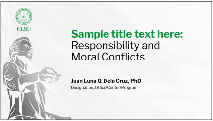
| PowerPoint Presentations | |
|
|
||
| Social Media Contents | |
|
|||
| Brochures/leaflets/ Event programs/ Annual Reports | |
|
|
||
| Event banners/ Greetings/ Congratulatories |
|
|
|||
| Sports publications | |
|
Siever
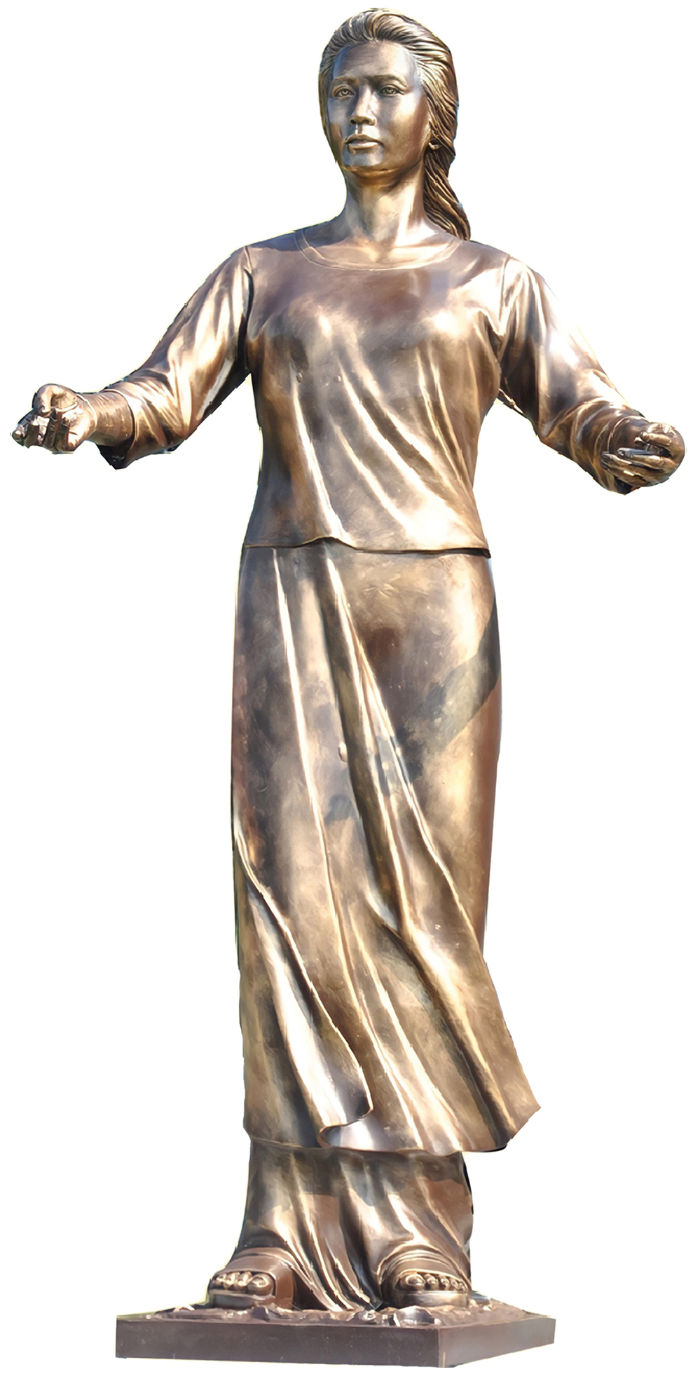
Upon entering the University, Siever is one of the landmarks that welcomes everyone, especially the students, with open arms who's like a mother or mater (informal use of the Latin word for mother) waiting for her children. A mater that embodies hope and opportunity for those who seek quality and excellence in education.
The six-foot statue of Siever, made by an award-winning sculptor, Mr. Juan Sajid Imao, was constructed as an icon that stands for an idea and institutional philosophy to provide an impact on the well-being of the people it serves. Behind it sets the story of the humble beginning of a school that became a university on June 18, 1964, through Republic Act No. 4067.
Siever is the universal symbol of a caring and nurturing institution.


Sieving for Excellence
This phrase dives deeper in the concept of 'sieving' as a metaphor for nurturing, refining, and sharpening peoples to pursue excellence in words and in deeds.
Use this as an alternate to the University taglines to highlight Siever as a representation of CLSU.
Siever Usage
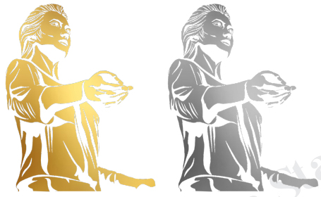
Siever can be used as symbol graphics of the University for print and digital materials.
DO NOT use Siever as substitute for letter, font, and icons
DO NOT overlap with text and graphics
DO NOT distort and stretch Siever
DO NOT alter assigned color palette
Athletics
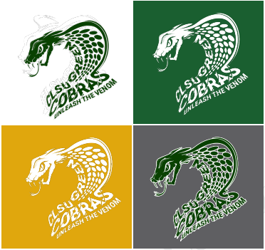
The CLSU Green Cobras
The CLSU Green Cobras Unleash the Venom trademark, wordmark, and colors shall be used in sports publications, uniforms, and advertising materials of the University
Facon typeface is used in the CLSU Green Cobra design.
Athletics team wordmark between the logo should have a minimim of a ‘C’ amount of space. A stroke is recommended when using a dark background.


Siel Variations
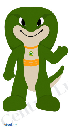

To embody the University’s values, identity, and spirit, Siel the Green Cobra is born. Derived from the acronym “CLSU,” the name “Siel” represents a fusion of letters that embody the spirit and essence of the institution, adding a personal and distinctive touch to the mascot that will foster a sense of ownership and connection among the CLSU community.
As the University’s official mascot, Siel the Green Cobra personifies the qualities of cobra such as strength, agility, and resilience—attributes that resonate with CLSU’s commitment to academic excellence, innovation, and leadership. The color green further reinforces the mascot’s symbolism, representing growth, vitality, and sustainability, aligning with CLSU’s focus on environmental stewardship, agricultural innovation, and community development. Siel is more than just a symbol; it is a figure that will foster a sense of belonging, camaraderie, and school spirit within the CLSU community.
Social Media

Publication Material
Dimension: 1500x1500 pixels
Resolution: 300 pixels/inch
Monogram size: W:176 H:237 pixels
The CLSU monochrome logo variations, with assigned scale size, shall be used in all social media materials.
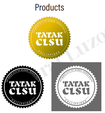
Tatak CLSU Trademark
Tatak CLSU trademark (gold, black, and white) shall be used exclusively for generated food and non-food products, merchandises, and related advertisements.
This should not be used as logo by individuals and organizations. Also, it is not recommended for use of communication letters, unless being the subject matter.
Video Production

Signature Extro
The signature extro contains the CLSU seal and tagline together with our online accounts.
This shall be used in all corporate videos across centers, colleges, and offices to keep our brand messaging consistent.
Use a minimum Full HD size (1920x1080) in video recordings and outputs.
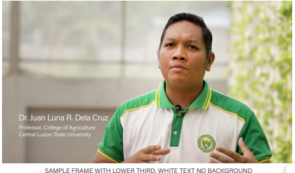
Lower Third
This is the standard lower third in labeling identifications using the CLSU green and white for the design.
The Acumin Pro Light is used for the name label while Acumin Pro Regular is used in the subheading. Please note that the subheading is smaller in size by 3 points.
Either the official job title or project designation may be used for subheading. It is a case-to-case basis.
Lower third shall be visible for 3-5 seconds duration.
Lower Third

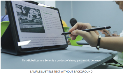
Subtitles
The Acumin Pro Medium may be used for subtitling, centered, 40pts size, and positioned above the safe margin. Either use a black background or plain text only


Central Luzon State University
Science City of Muñoz, Nueva Ecija, Philippines 3120- Central Luzon State University, Science City of Muñoz, Nueva Ecija, Philippines
- op@clsu.edu.ph
- +6344-456-0688